by stefanismit • Uploaded: Mar. 16 '12
Add to Pad (In 0 Pad s )
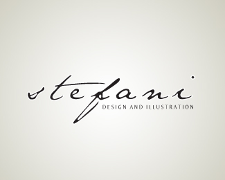
Description: Logo for myself. Status: Client work Viewed: 1914 Share:
nice font, maybe they dont all have to be so level? The font used is grungy maybe the letters could be a bit more uneven.
@paulychops - Thanks, I'll definitely try that out! :D
Please login/signup to make a comment, registration is easy
Follow


Lets Discuss
nice font, maybe they dont all have to be so level? The font used is grungy maybe the letters could be a bit more uneven.
Reply@paulychops - Thanks, I'll definitely try that out! :D
ReplyPlease login/signup to make a comment, registration is easy