Description:
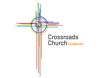
Logo for a church in Edinburgh, Scotland. They wanted something classic with a modern twist. So the idea behind this logo is that all the lines signify the different paths of peoples lives intersecting, plus a public transportation style map (subway) and all of that forms a Celtic cross. Lots of meaning.
Status:
Client work
Viewed:
1582
Share:


Lets Discuss
I like this, and the thinking behind it. I think you could simplify a bit and not loose anything.
ReplyPlease login/signup to make a comment, registration is easy