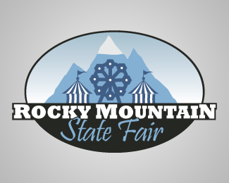
Colorado Fair
by sparksmemphis • Uploaded: Feb. 29 '08

Float
(Floaters:
1 )
Description:
Took another stab at it.
I'm having trouble picking a 2nd font that fits with the rocky mountain and i definitely like that font for this logo.
made the mountains a little more aggressive to go along with the slab serif font. i think the script style goes good with the slab serif but i cant make up my mind and im having trouble positioning it right underneath.
suggestions would be great.
Status:
Nothing set
Viewed:
2022
Share:


Lets Discuss
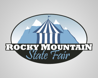
I think the mark is coming along. Here are a couple suggestions...*- The mountains are uncomfortably in between realistic and artistic. I think you should either add some more detail or simplify the lines even more. They probably need a little more variation too, they look like 3 triangles. More shadows and highlights will help add detail (if you want to go that route.)*- I looked at the other version of this logo and I don't think the type is bad. When you add the script font it takes the logo to a more informal place. Personally I like the other type better, it's just a matter of what you're trying to communicate. I don't think the position is awkward, I think it's a matter of the typeface not being a good enough match, which is making that area uncomfortable. But, if you want the logo to have an informal element to it, I'd recommend using type that is slightly more flowing. Check out the link for other script typefaces...*http://www.veer.com/search/results.aspx?producttype%3Dtyp%26clarify%3Dfalse%26keyword%3Dscript or handwriting or calligraphic or calligraphy%26WT.ac%3Dtype.browseby.scripts*- The black oval might be a little too thick*Having said that, I think the mark is on its way, you just need to keep working with it and don't be afraid to sketch the idea first.
ReplyThanks a ton for the help!*After getting away from it for a weekend im definitely seeing what you're talking about. the mountains just aren't doing it for me now but i think they should be agressive still. **I know my boss is going to say its not %22fun%22 enough because he thinks a logo should reflect exactly what it is your selling, so i think the informal approach with a script font is a good idea for that. If i had my way id stick with the slab serif for the whole thing and just use color. **and yeah. the black circle needs to match the stroke around rocky mountain. it is to thick. **Thanks again for the help!
ReplyI just had a thought. You mentioned a more 'fun' concept. What if you made the mountains look almost like tent tops? Perhaps some subtle stripes of the same blue color you have in the peaks. They are kind of swoopy looking at the moment (at least in your other post). It might give the logo a more 'county fair' feel to it and include the iconic Rocky mountains in the concept. To top it off you could have a waving pointed flag on the highest peak to give it a very readable tent feel.**Just some suggestions.
Replythats a pretty good idea! thanks. i'll give it a go today probably and upload it. Thanks!
ReplyPlease login/signup to make a comment, registration is easy