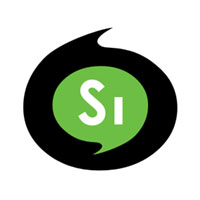
Soyebo Interactive
by soyebo • Uploaded: Jul. 30 '08

Float
(Floaters:
1 )
Description:
Potential choice for Soyebo Interactive logo... depends on the feedback I get. :)
Status:
Nothing set
Viewed:
1467
Share:
Lets Discuss
Did you go for the SI%3DYES?
ReplyNot initially... I was trying to maintain some degree of rotational symmetry hence the 'i' being smaller than the 's'. Once I had this version I thought that the 'si' as 'yes' kind of went with the colour green for 'go' so I kept it. :)
ReplyThis doesn't look bad at all... Just 2 things: I think that the whole symbol should be a bit smaller and those curves should be repared towards more continuous flow... The logic of the green makes sense... I saw that YES at the first glance...
ReplyWhen you say the whole symbol should be smaller...
ReplySmaller, not bigger... Curves are much better this way...
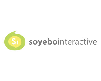
ReplyI'd uploaded the wrong one... lol. This is the right one
ReplyWhy did you delete the font? We can't see if it's smaller now... Smaller symbol and new balance with the type...
ReplyMy bad... now I get you. Thanks.
ReplyPlease login/signup to make a comment, registration is easy