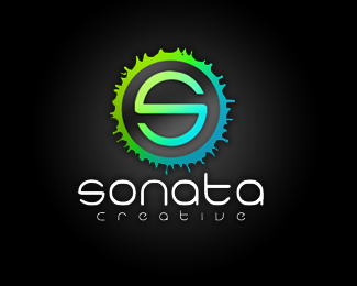
Octbox Software Development
by sonatacreative • Uploaded: Oct. 24 '08

Float
(Floaters:
2 )
Description:
I updated my previous 'octbox' logo to this version. The '8's are now more fluid and consistent with the title font. They also connect with one another at the face edges... something that I did not have in my previous version. Totally open to comments- this logo is available on IncSpring for purchase.
As seen on:
IncSpring
Status:
Nothing set
Viewed:
3393
Share:

Lets Discuss
I think your really onto something with your circles here. This one is much better.If you can make the top oblique work perfectly into the sides perfectly then it would be just totally awesome. Its pretty neat now however.
ReplyPlease login/signup to make a comment, registration is easy