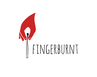
Fingerburnt
by somebodyhere • Uploaded: Nov. 30 '15

Float
(Floaters:
18 )
Description:
The logo mark is a visual pun where what initially looks like a burning match turns out to be a hand holding a burned matchstick (or extinguishing the flame) at a closer look.
The logo has been revised after a few helpful tips from logopond members (thank you guys!)
Status:
Work in progress
Viewed:
2941
Tags:
fire
•
fingers
•
hand drawn
•
hand
Share:
Lets Discuss
I like the concept.
ReplyI think you should remove two fingers on the left.
Thanks for the idea, but I'm afraid it won't be recognizable as a hand in smaller size.
ReplyIt's not recognisable as a hand at smaller size even with the extra fingers although the idea is good.
Replythe idea is excellent. I'd keep the fingers, but the extra detail isn't needed at all. even at larger sizes. the only tweaks I would make is to enlarge the hand a bit to make it more in proportion to the match (that is why it is hard to recognize it as a hand at all), and then move the hand up a smidgen to place the fingers a little closer to the top of the match (will also help make the hand a little more recognizable). but even if you don't change anything, I still like it.
ReplyThanks for the tips, I'll try to tweak it a bit and see how it turns out.
ReplyPlease login/signup to make a comment, registration is easy