Description:
robin
As seen on:
robin
Status:
Student work
Viewed:
1062
Tags:
robin
Share:


Lets Discuss
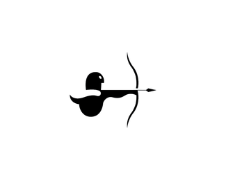
The black line just to the left of the arrowhead should be about twice as thick. Solid work though.
ReplyOnly the Sith deal in absolutes! The whole bow and arrow would look a bit better a bit thicker :), it is quite nice!!
ReplyPlease login/signup to make a comment, registration is easy