by sleep-zero • Uploaded: Feb. 24 '08
Add to Pad (In 0 Pad s )
Description: logo entry Status: Nothing set Viewed: 766 Share:
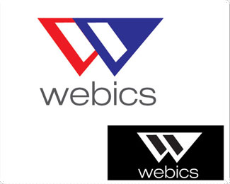
Maybe try top-aligning the text with the mark and giving the two left-most pieces the same angle as the W. The angles are off.*I'm not a fan of the font used and would fix the kerning between the c %26 the s
I think you did another version of this logo that's a red ribbon. I like that version much better.
thanks for the comments guys :)
Please login/signup to make a comment, registration is easy
Follow


Lets Discuss
Maybe try top-aligning the text with the mark and giving the two left-most pieces the same angle as the W. The angles are off.*I'm not a fan of the font used and would fix the kerning between the c %26 the s
ReplyI think you did another version of this logo that's a red ribbon. I like that version much better.
Replythanks for the comments guys :)
ReplyPlease login/signup to make a comment, registration is easy