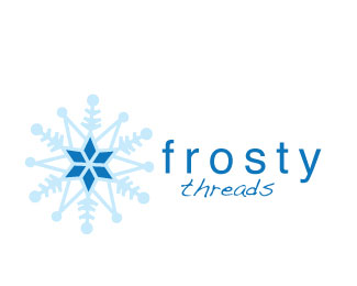
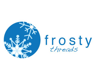
Frosty Threads
by sjustice.bear • Uploaded: Dec. 10 '11

Float
(Floaters:
0 )
Description:
Logo for winter accessories line. (gloves, hats, scarfs)
Status:
Student work
Viewed:
758
Share:

Lets Discuss
Well, not exactly what I had in mind.... However it works. I think that your stroke on your snowflakes needs to be thicker, and now that I am seeing the final product I think we should stick to just one snowflake centered in the circle.
ReplyThis logo isn't bad but I think that the snow flakes are a little thin. Plus I think that it still look more like a Christmas ornament.
ReplyI am with %22Vision%22. Make the stroke larger on the snow flakes plus what is the most common thing known about snow flakes? Their are no two a like so make a version with two different types of snow flakes. I also like the idea of putting one flake in the circle. Your fonts are good and I love your colors.
ReplyI love the design! I wonder what if you just did one snowflake but put it off center in the middle to bottom left of the big circle. I do love the color scheme it goes well with what your logo is for.
ReplyI agree the snowflakes are too thin, I like the other two better.
ReplyI quite like this one. It makes me think of something printed on a shopping bag at Christmas time and you open the bag and there is like a sweater inside or whatever. Seriously, that is exactly what popped into my head when I saw this. **Not real sure about the font used for %22threads%22 though.
ReplyPlease login/signup to make a comment, registration is easy