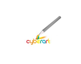
Hey shortbus408,%0D*%0D*Whoa, the rainbow ultrapixelated text sure is hard to look at (though it does go in ROY-G-BIV order... hidden science :)%0D*%0D*It's a big illustration of a brush and palette, which is kind of commonplace in computer icons. I personally think the brush head itself is somewhat visually interesting but it will take some work to make it into a logo. Here's a quick and very generic simplification idea of the brush head, just as a brainstorm:%0D*%0D*%3Ca href%3D%22http://metaeducation.com/logopond/cyber%2520ar1t_2.png%22%3Ecyber ar1t_2.png%3C/a%3E%0D*%0D*Note that %22cyber%22 lined up with the paint spill, so I made it a different color to call that out. If you just keep looking for alignments and shapes you might be able to find more things that make it a strong logo...%0D*%0D*Regards,%0D*met%26aelig%3Bducation


Lets Discuss
it looks more like an illustration than an icon, it's good but the drawing is poor, try to get something more realistic in perspectives.
Replythan a logo* actually it looks like an icon too :P
ReplyHey shortbus408,%0D*%0D*Whoa, the rainbow ultrapixelated text sure is hard to look at (though it does go in ROY-G-BIV order... hidden science :)%0D*%0D*It's a big illustration of a brush and palette, which is kind of commonplace in computer icons. I personally think the brush head itself is somewhat visually interesting but it will take some work to make it into a logo. Here's a quick and very generic simplification idea of the brush head, just as a brainstorm:%0D*%0D*%3Ca href%3D%22http://metaeducation.com/logopond/cyber%2520ar1t_2.png%22%3Ecyber ar1t_2.png%3C/a%3E%0D*%0D*Note that %22cyber%22 lined up with the paint spill, so I made it a different color to call that out. If you just keep looking for alignments and shapes you might be able to find more things that make it a strong logo...%0D*%0D*Regards,%0D*met%26aelig%3Bducation
ReplyPlease login/signup to make a comment, registration is easy