BLAST
by shippusengan • Uploaded: Jan. 13 '14

Float
(Floaters:
2 )
Description:
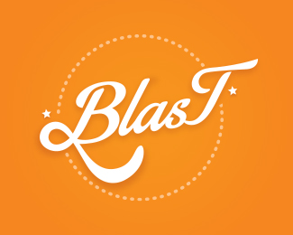
A couple asked me to do a logo who represents a clothing brand for youth which name is a combination of their names: Bruno and Telma with an explosion. Then, the name that they have created was BLAST. They also said that they prefer to put both letters B and T featured, so before I finish the logo I'm waiting for your critiques people.
Status:
Client work
Viewed:
2711
Tags:
marks
•
branding
•
brand
•
design
Share:
Lets Discuss
The first thing I would say is go back to your clients and have a discussion about the B and T being featured. I think as a designer you shouldn't just say YES, SIR to every request, but rather try to get to the root of the design problem and try to come up with a solution that fits. Featuring the B and T letters in a word that doesn't really allow it seems like a huge ego thing to me on their part. Is the brand for youth or is it for them? Seeing the T huge here is really strange--plus, we're used to seeing the initial letter larger so it doesn't stand out like the T does. That last letter creates a really strange anomaly. The connection to the B and T is really fat and awkward too. That said, I'm not getting any explosion aspect to this. Maybe there doesn't need to be, perhaps the red does that. But there probably should be some explosive feeling to it. Why the crown? I'm not sure where that's coming from or what the connection is. Lastly, I think you're relying pretty heavily on effects--drop shadows and a gradient. If you can find a way to visually communicate your message without those effects, I think it will be more impactful. I hope this didn't come across as too harsh--sometimes that's what a good critique is though.
ReplyThanks a lot Samdemastrie, I really had that doubt about the B and T and you helped me to confirm. I know that they're a couple but as just you said, the brand is for the youth around the world and not only for them. I'll work for turn the logo more simple too. Thanks a lot and I'm always open for good critiques
Replyas it is now, it is a serviceable logo. great logo? no. but serviceable. Sam's critique hits all the high points. I would suggest that you could put a little emphasis on the t without overdoing it. leaving it unconnected helps put a little more emphasis on it. a lower case t where the cross is closer to the top than standard, would help, too, without overdoing it. and you could de-emphasize the B a little in similar ways to give them both a more equal punch without adding confusion. the crown seems to be where an explosion should be. a simple burst behind the text would give you the explosion where the crown and simple round circle do not. I like the layer of text over a burst, but instead of having the text lay on top, why not make it look like it is slightly cut from the burst on either side? just a thought to try.
ReplyThanks TheArtist, i'm working on a version that will be more simple. When it's finished I'll put here to receive more critiques, thanks a lot for the help!
ReplyPlease login/signup to make a comment, registration is easy