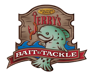
Bait & Tackle logo
by shielddesign • Uploaded: Apr. 28 '10 - Gallerized: Apr. '10

Float
(Floaters:
42 )
Description:
Designed for a small town bait and tackle shop.
Status:
Work in progress
Viewed:
11215
Share:


Lets Discuss
This is very nice looking. Cool!
ReplyLike I mentioned in the forum, the only thing that bothers me is the weight of the 'J'. Besides that, looks fantastic :)
Replyawesome job! agree with the J.. if you thicken it a tad I think you're golden.
ReplyLove it. Same comments as above and I would also like to see the entire word, Jerry's, made larger. It's a little lost in the composition.
ReplyNicely done
ReplyLove the feel! Great work!!
Replynice!
Replyvery nice. the only problem i have is how the logo will look at a smaller size.
Replywonderful fish illustration! well done :)
ReplyPlease login/signup to make a comment, registration is easy