Description:
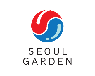
I think the existing logo is a bit boring, so i decided to give it a new look. Based on the hot and spiciness of their dish.
The Yin Yang of hot and cold.
Notice the tongue and the water?
Compare with the old logo here: www.seoulgarden.com.my
Status:
Just for fun
Viewed:
2644
Share:


Lets Discuss
Please login/signup to make a comment, registration is easy