Latenightproject
by shahrulazmi • Uploaded: Feb. 25 '10

Float
(Floaters:
0 )
Description:
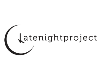
latenightproject is a name given to a duo of photographers, who only seems to be able to get any discussion, work done late at night. And they wanted something to show that part in their logo
Status:
Nothing set
Viewed:
1297
Share:


Lets Discuss
why not show the hands at 3 oclock? concept is there, but needs a little tweaking.
Reply@shahrulazmi Think you might want to add some night reference in there, cause it can looks like 4pm instead. Maybe at least a darker color theme? **@ Paul, 4a.m. seems to be the magical worst possible hours , check this clip out for fun :)*http://www.ted.com/talks/lang/eng/rives_on_4_a_m.html*
ReplyYou might want to realign the center of the clock with the hour lines. I like the concept, would read great with 3 AM. Also, black clock suits better.
ReplyTry to use also the clock on the O of word PROJECT
Replymaybe incorporate a crescent moon shape into the clock face?
Replythanks a bunch for the comments, sometimes a fresh pair of eyes really can help*ive put all the comments into consideration, and amended with another proposal*here http://logopond.com/gallery/detail/96595
ReplyPlease login/signup to make a comment, registration is easy