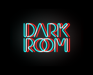
Float
(Floaters:
70 )
Description:
Logo for a film and television production company.
Status:
Client work
Viewed:
36473
Share:

Lets Discuss
I really like this, minus the glow.
Replythanks! i put a little makeup on it for logopond. the version for print is just single white line with no effects whatsoever.
ReplyNice, I like your concepts
ReplyThis is gallery-worthy. Fabulous work.
Replythank you!
ReplyGreat!*Im sorry they didnt choose this version.
Replythanks chris! they chose this one! i'm working on two logos for two separate production companies, it's a bit confusing, i know... :)
Replysweet effect, prefect for this client.
ReplyI'm enjoying everything about this!!
Replyyes, love the feel
ReplyNice job
ReplyNot a big fan of this one. It seems this kind of effect has lost its luster and originality.
ReplyIt explains well what it's for, good job.
ReplyHey, that's pretty neat. I could do without the glow too...but to each his own.
Replyneat indeed.
ReplySuperb.
Replyfresh
Replyrotten
ReplyFANTASTIC WORK!!! can you send me an email, I need a logo...thank%B4s
Replygreat stuufff
ReplyVery well executed! Kudos!
ReplySuper! Simple and powerful idea... and the glow effect is great.
ReplyGreat. Neon logos are difficult, I think. But this was pulled off well.
ReplyI just tried wearing 3D glasses, and guess what? it works! That's a really good interactive logo. I hope more people try this. Simple and clean.
ReplyNice work, but I have to admit that the effect makes me feel nauseous after looking at it for a few seconds.
ReplyVery nice, it's fit very well for a film logo
ReplyIm sorry they didnt choose this version.
ReplyPlease login/signup to make a comment, registration is easy