Float
(Floaters:
2 )
Description:
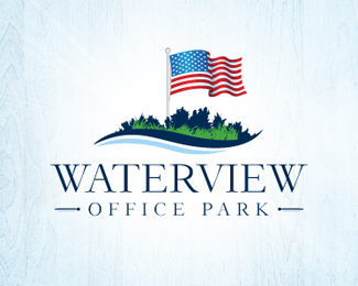
Logo for a high-end office park in OKC.
Status:
Unused proposal
Viewed:
3512
Share:

Lets Discuss
Very nice!*I like the mark and type is also great. It seems to me that you have 3 different illustration styles in the mark, flag is beautiful, than very detailed bushes and grass, then one swoosh simplistic water. I just think that by simplifying grass and bushes you'll make this logo awsome.*Good luck!
ReplyThanks for your feedback, Balic. I think that's a really good suggestion, and I will continue working with it. Appreciate it!
ReplyPlease login/signup to make a comment, registration is easy