Float
(Floaters:
4 )
Description:
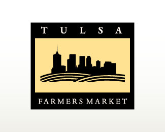
A fictitious logo for the Tulsa Farmers Market.
Status:
Nothing set
Viewed:
2390
Share:

Lets Discuss
Nice Seth.
ReplyVery nice. The only thing I would have done differently is to enlarge the center graphic to help fill the space out more. It feels a little lost in a sea of beige right now. I think that by enlarging it and incorporating the ground lines into the framework it'll make it more dynamic.
ReplyPlease login/signup to make a comment, registration is easy