Description:
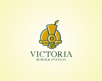
burger restaurant with the London Victoria Station as a theme
As seen on:
http://www.flickr.com/photos/sebastiany/1526226472
Status:
Client work
Viewed:
6512
Share:




Lets Discuss
wow really like this, great job - great use of colors.
Replypretty cool sebastiany, but i had to click on your flickr link to see a cleaner version of it. The white accents in your milkshake/smokestack and the burger get lost in the logopond version. you may want to increase the overall size of your logo here.
ReplySweet! Didn't notice the milkshake/smokestack at first. Very clever.
ReplyVery nice, Seb! Burgers with 'art deco' touch... Who would ever say that it could work together?
Replythank you all !!**@Gyui... you are right... sometime the image must be bigger**@ Ocular... thats the effect we propose... a surprise, to people to discover the image only in a second look**@Type... that was the challenge... the theme of this burger house is a Victorian London rail station
ReplySuper cool Mark
ReplyPlease login/signup to make a comment, registration is easy