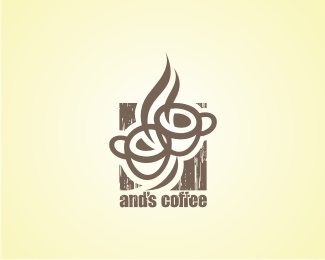
Description:
coffee shop
As seen on:
www.flickr.com/sebastiany
Status:
Unused proposal
Viewed:
3317
Share:



Lets Discuss
I like the style. Not sure how I feel about the cups/steam not be affected with the texture. And the tiny trapped white space from the cup overlap is awkward. But very nice mark.
ReplyI agree with Glen. Have you tried this with the texture applied to the entire logo?
ReplyIn this project (from 2004) we have to had 3 versions (what is a problem in fact). One for smaller applications, without the texture, one for bigger applications (with texture all over the logo) and this one in between... but I have to admit I could be improved.
ReplyYeahh..! I too love the style but not a fan of the texture.
ReplyPlease login/signup to make a comment, registration is easy