Float
(Floaters:
0 )
Description:
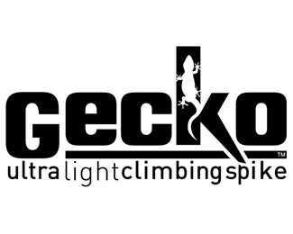
Logo for a brand of climbing spikes known as the lightest on the market.
Status:
Nothing set
Viewed:
3615
Share:

Lets Discuss
I think you should make the %22G%22 the same height size as the %22e%22 and extend the underline underneath it. That would de-emphasize the %22G%22 and allow the spiked %22k%22 to have more prominence, which is really the whole purpose of the logo. I would also try to extend the spike of the %22k%22 down more and make your tagline type smaller so it aligns to the left of the spike. It might also be cool to have the gecko's tail follow down the length of the spike.**Just some food for thought.
ReplyOne last thing I noticed - the kerning between the %22k%22 and the %22o%22 needs to be tighter. You should let the spike of the %22k%22 just overlap the %22o%22 and add separation with a white rule.
ReplyGoodness. Too much going on.
ReplyAt size on materials that gecko is going to be a hard read. I think you need to rethink scale on this. Post it at half the size you have it now and you'll see what I'm saying.
ReplyPlease login/signup to make a comment, registration is easy