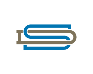
Description:
Playing around with my initials (SD) for personal branding. Thought I'd see what my fellow designers thought about it.
Status:
Work in progress
Viewed:
3525
Share:



Lets Discuss
Very sleek, and I dig the colors.
ReplyThanks Todd. Appreciate it.
ReplyI approve, maybe less wide.
ReplyThanks for taking a look Jerron. I'll have to play a little and see if that does the trick. I'll let you know.
ReplyI like it as it is ... it's always a question of taste ... and ... of course ... readability ... so it works I think ...*although your current one (negative on blue) isn't that good to read ... but ... I like it much more because of it's striking uniqueness ... only my opinion ...
ReplyThanks again Tas. I would definitely agree that my current logo that I'm using as my avatar doesn't read as well as this version - it's more of a graphic solution. But the intent of my avatar logo was that it would normally be paired up with my full name spelled out in some way, so I wasn't as concerned about the letter forms individually standing out.**I really appreciate the comments though. You've got a great portfolio btw.
ReplyPlease login/signup to make a comment, registration is easy