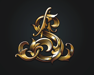
SA full version
by sbdesign • Uploaded: Dec. 24 '10 - Gallerized: Mar. '11

Float
(Floaters:
108 )
Description:
The full version of a logo for the known engraver
Status:
Work in progress
Viewed:
25940
Share:


Lets Discuss
i have no words...:D
Replywow! this is stunning!
ReplyThis is sick!
ReplyBeautiful mark!
ReplyAmazing, as usual.
Replyfantastic detail...
ReplySpasibo...ia staralso:)
ReplyAmazing work, Bro!
ReplyI echo everyone else's words. Yowzers. Excellent work!
ReplyThnx chirp!)
Replywhat a beauty
Replysensational
ReplyWOW!
Replygreaaat
Replyman you are on fire!! HOT
ReplyI would like to touch it! So much perfect...
ReplyKak mojno takoe zakrutit? Ne predstavljaju %3B)
Replywow
ReplyMy gosh... superb!
ReplyThnx guys :)
Replyso sweet. amazing detail, yet clean.
ReplyThnx Mike!
ReplyAmazing detail.
ReplyThnx Roy!
ReplyFantastic man.
ReplyThnx Pierro!
Replyyou have a delightful sense of light and shadow. Well done!
ReplyThnx lumavine! :)
Replybeautiful, memorable, excellent execution! congrats, mate!
ReplyThe font of words are not very suit to the logo.
Replyohuenno, chuvak!
ReplySpasibo chuvak!:)
Replyvery impressive. I am thinking if a similar style can be used for my wine label. my Email is cnhewo@googlemail.com
ReplyWow. Very impressive. Good detail.
Replyunbelievable ... brilliant work
ReplyCan I discuss this on a logo design podcast? It's so beautiful!
ReplyThis is ridiculous! Well done...
ReplyWow!*Amazing mark design!
ReplyThanx guys!:)
ReplyAwesome logo! It looks like it could be carved out of stone. My only suggestion perhaps, is that the name should look like it is also carved, since it is for an engraver.
ReplyPlease login/signup to make a comment, registration is easy