Description:
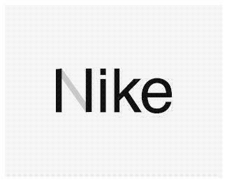
Expressing love for my favorite brand - part of a classroom project called "Expressive Typography".
Status:
Nothing set
Viewed:
3766
Share:


Lets Discuss
Hi Satya,**Hm, I did not see the I like at first, it came to me only after I red the description... But I like the idea... Maybe you find a better solution to the grey diagonal bar, making the N (have you tried a solid black bar, but not connected to the stems of the N, I mean I and l...?) Worth a try, maybe?**Cheersuzan!
ReplyThanks for your comments, suzan.*Yes, I have an another version with a dotted diagonal instead of this Grey bar. I am waiting for a few more comments - gonna correct this soon.
Replyjust put a little swooosh there?
ReplyOh yes, I should have done that. :-)*Will give it a try.
ReplyA slight update!
ReplyCreative work!
ReplyPlease login/signup to make a comment, registration is easy