SND
by sarahnevilledesign • Uploaded: Jul. 08 '14

Float
(Floaters:
0 )
Description:
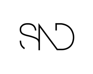
The brief was to create an identity to represent myself as a designer and also to create a stationary suite with the use of the logo created. I took a detailed look into the combination of two letters to create one identity with the use of angles, lines and also slicing a letter to create a dynamic shape.
I payed particular attention to the colour palette and how the use of black and white make the identity professional. The concept of having my identity stamped onto a business card or letterhead as if I am making my mark really appealed to me so I took my identity in that direction. I took the elements and colour tone used within the logo to set the tone across a variety of applications, both print and digital. The minimalistic use of colour makes the stationary suite visually striking and stands out immediately. The colour and style ties this identity together through a variety of applications.
As seen on:
sarahnevilledesign
Status:
Client work
Viewed:
2404
Tags:
type
•
font
•
logo design
•
typography
Share:

Lets Discuss
Please login/signup to make a comment, registration is easy