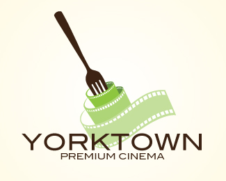
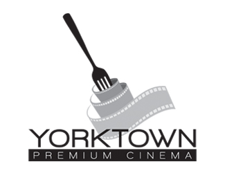
Yorktown Cinema Option 4
by sapeakedesign • Uploaded: May. 17 '11

Float
(Floaters:
3 )
Description:
Logo for a high end restaurant and movie theatre concept. Option 4
Status:
Work in progress
Viewed:
1903
Share:

Lets Discuss
nice change. agree w/ben
Replyyup, you're on to a winner here. Just as Ben suggested, I'd make everything smaller, move the copy away from the mark, move the secondary text away from the primary, maybe tracking it out slightly. I'd try a version that was on a dark, deep red background, with the type and fork in silver, and the reel in the same color as the current background (pasta color). I'd then try another to see what it looks like in one color. good luck, and i look forward to the result!
ReplyYou might also try making all the sprocket holes the same size as the strip on the bottom. The idea is that the film is more tightly wound around the fork, not that it is smaller. Great concept, and the execution is getting there.
Replyyup, good catch %5E*
ReplyNice changes so far!
ReplyThank you everyone for the comments!
ReplyYES! I like these changes much better! The orange is much better.
ReplyNice concept man!
ReplyCool!
ReplyPlease login/signup to make a comment, registration is easy