Float
(Floaters:
3 )
Description:
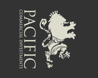
Strong Identity for a Investment group.
Status:
Nothing set
Viewed:
4636
Share:


Lets Discuss
This is a very nice looking lion!
ReplyTo me this is not symbolic of strength. Its a lion in what appears to be tights and a Cind Crawford mole.*The snout looks off.*The major problem with this logo is that it has been seen a thousand times now. Compare this to any other heraldic lion at a size of 2cm x 2 cm and you will see this.
Reply... whats the pattern behind on the lower part signify out of interest
Replythe only problem you have is that if you try to print business cards or letterheads for them the details won't show.
ReplyPrint detail depends on how good of a printer they can afford. The pattern (and let me know if I am wrong) appears to be the engraving detail on the background of most paper money. The lion is very well done. I can see where if someone is not that familiar with lions or heraldry, they would not see it properly. You must have drawn this yourself. I've had to do heraldry logos before and, in all my research, never could find a modern looking rampant lion with a mane anywhere near as nice as this. I really like the logo%3B although, it may have a little too much going on. It is not very straight forward. It can (and has it appears) caused some confusion.
ReplyPlease login/signup to make a comment, registration is easy