Taurus
by ryorespati • Uploaded: Oct. 01 '09
Description:
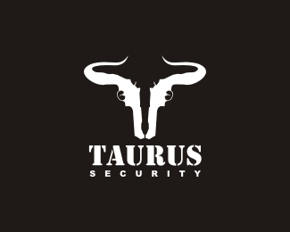
two guns for a bull head. A powerful logo and brand.
Status:
Unused proposal
Viewed:
932
Share:
Lets Discuss
love the brand very clever, but not sure about the Taurus typo
Replynice
Replyrespect.
Replybrilliant mark! agree about the type though
ReplySorry, but it looks quite a bit like %22uterus%22:http://images.google.ca/images?q%3Duterus too
Reply%5EHaha Alex, you sure do know your anatomy!
ReplyI have to agree with Rincon. The mark looks really good, but the font used for Taurus I think could be stronger.
Reply@epslin it's a UTaurus %3B)
Reply%5E Haha! I didn't know being such talented also came with such a grasp of puns. I really like the icon, but I'm going to have to come to terms with the type before I like it completely. Good work.
Reply%5E%5Elike that? %3B) no in all seriousness. this is a very clever concept. I just think the gun stocks could be worked better to no look so much like what epsilon said. And agree a more western typeface.
Replya more western font, yeah...
ReplyPlease login/signup to make a comment, registration is easy