Sacred Infusion
by ryantoyota • Uploaded: Nov. 23 '07

Float
(Floaters:
10 )
Description:
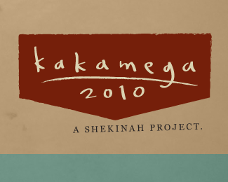
Concept for a prayer ministry. The symbol represents an S, an I, and a candle.
Status:
Unused proposal
Viewed:
3615
Share:


Lets Discuss
Thought I'd post this here for some critique as well, as I don't think everyone makes it over to the forums. The forum post is %3Ca href%3D%22http://logopond.com/forum/viewtopic.php?id%3D1238%22%3Ehere%3C/a%3E if you're interested.
ReplyGreat job, Ryan. One of your best to date. Some quick suggestions:**Have you tried a dark brown color for the type?**Have you tried adding any serifs to the icon?**Other than that, this is stellar.
Replyvery nice Ryan.. agree with Kev that this is your best to date.. almost Hebrew looking in shape %26 form.. dont know if that was intentional however... but it really bodes well with the 'sacred' part of the concept... good stuff!
ReplyI love the S and the I and for sure the candle. But the red, the type and the end of the light of the candle remind me something %22satanical%22... Perhaps just another color for the S?
ReplyJust took a peek at the forum to see how this has taken shape. Gorgeous mark. Definitely your best piece, Ryan. The type is playing tricks with my eyes tho... maybe I've been staring at my screen too long.
Replyi think its the kerning Roy %3B)
ReplyWow, amazing. This is why I come to this site. **Instafav'd!
ReplyNice to see you back with some great pieces ryan! Red works well, more sacred than satanical I think. Cheers.
ReplyRyan I love the mark man, however the type seems a little bland for this unique mark.
ReplyHi Ryan, like I stated in the forums, i really like what you have going here. I love the mark. However I feel you can gain something by not going as thick with the stroke and perhaps following more of the contour of the candle and flameThis would allow for the flame. I think it (the negative space/candle) needs to be breathing a little more. I also agree with Bart, the type is not quite complimenting the mark just yet. I Really like what you have done so far, just feel there is room for improvement IMO.%0D*
ReplyIt looks like a red snake rapping around a little boy.. But i think its just because I considered the context..
ReplyPlease login/signup to make a comment, registration is easy