Daniel Moyer Photography
by ryanlynndesign • Uploaded: Feb. 03 '10

Float
(Floaters:
28 )
Description:
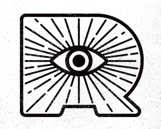
The logo for Daniel Moyer Photography had to be broad enough to cover multiple areas of expertise while at the same time carry a high-end look for prospective wedding clients.
As seen on:
http://www.danielmoyerphotography.com/
Status:
Client work
Viewed:
26823
Share:


Lets Discuss
cool mark
ReplyAgreed. The mark is nice. Very well drawn with a great use of negative space. The font isn't quite right for my liking, but that's all subjective. :-)
ReplyThanks for the feedback guys!
ReplyI really like the font choice, bold and out there, but still professional.
ReplyI keep coming back to this one. Nicely done.
Replyvery nice mark.
ReplyIt might help to give a little more space between the two lines of type?
Replyagree. Photography is too close. make it the same distance below the name as you have above between the name and illustration.
ReplyThis is so bitchin.
ReplyThanks for the feedback. Unfortunately the logo has already been implemented, so whatever tweaks it needs will have to wait until a future redesign.
ReplyI really like this, nice work.
Replylooks GREAT!!!
ReplyI want this LOG's PsD ,please
ReplyVery nice logo. Where can I buy it? Or can you send me the PSD file? Thank you
ReplyPlease login/signup to make a comment, registration is easy