
Description:
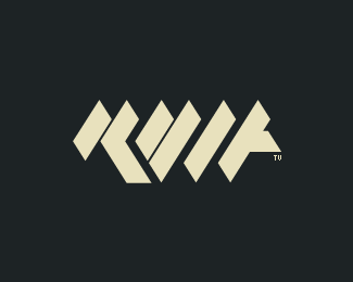
A version of my personal logo that i will be using in my blog. The result on the blog works way better this isolated version.
As seen on:
blog.rvlt.tv
Status:
Client work
Viewed:
2152
Share:




Lets Discuss
love it, even if I didn't read rvlt at the first sight. Maybe if you put a small triangle on the bottom of L??**Anyway, great work
ReplyHey icu, thanks for the feedback, you can check the main logo in my gallery, i know he's not easy to read, but i'm not looking for it, i want to create a stong icon more than a readable logo.
ReplyPlease login/signup to make a comment, registration is easy