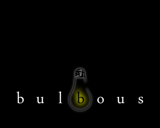
Box
by rulfzid • Uploaded: Aug. 17 '09

Float
(Floaters:
13 )
Description:
This is my first upload. I'm new to this - learning, playing, tinkering - so any and all feedback is appreciated.
Status:
Just for fun
Viewed:
1671
Share:


Lets Discuss
good concept ....
ReplyNice idea. I think you should add two holes in the letter 'B' as you also did in the 'O'. That subtle detail makes the logo more clear.
ReplyNice indeed.
Reply*@cthree, @lefty, @beandesigned, @epsilon***Thank you for the kind words.***@beandesigned***I actually almost didn't even add the hole to the 'O', as I wanted each letter to be as much like a cardboard pane as possible. I'll try adding more definition to the 'B' and see how it goes.**Just so I don't do anything stupid - is it frowned upon to upload multiple versions of the same logo?
Replywow...thats a bright start...very well made...
ReplyUploading multiple versions of the same logo isn't stupid. If you'll refer in the description to the other logo concepts, people can judge and make constructive criticism about which one is better.**I see what you mean with keeping the cardboard plane as possible. But I doubt the logo is readable when people don't know the name. If you'll know it's 'Box' it's obvious though.**I'm curious about the one with the holes in the 'B'.
Reply_@libran005_**Thank you. I took a look at your showcase - frankly, it's kind of scary to be getting compliments from people who actually know what they're doing.**_@beandesigned_**I'll put up a new version soon. Might even put up one with no holes, just to see what people think.
ReplyClever execution! Well done :)
ReplyPlease login/signup to make a comment, registration is easy