Description:
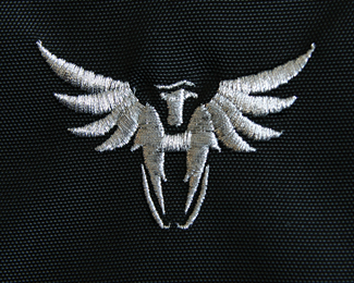
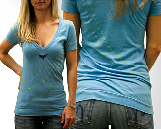
An application of the logo
As seen on:
rudyhurtado.com
Status:
Client work
Viewed:
2904
Share:


Lets Discuss
Tats interesting, How did u get this done.
ReplyThis is actually stitching on shirts, thanks for the comment.
ReplyThis is an updated version of the logo applied, I hope someone likes it.
ReplyI do like it. Someone wise once told me that the best logos have to perform as one colour, otherwise you're trying too hard - your mark does work and looks good embroidered too.
ReplyThanks Chris, I'm glad you can appreciate the do's and don'ts of marks that work, I'm sure you like me always think of the final applications of the logo at the time of the conception.
ReplyYou passed the emroidery test congrats. It's one of the processes that can kill some logos (from experience). I am campaigning for better embroidery practices that make for finer detail and gradients.
ReplyI agree, it took me a while to find my embroidery supplier but now that I found them, I'm not letting them go. Thanks for your input Cerice, love people from NZ, cool people mate.
ReplyMuch appreciated Serdar.
ReplyThank you Trish, good to hear from you.
Replyamazing :)
ReplyThank you very much Senol.
ReplyHey guys, does anybody know about this site? http://www.cssdaddy.com/identity/ it shows many of our work but no credits appear along with them, that kindda bothers me, anyone?
Replyyeah rudy... a few of the guys on twitter wrote to them... they promise that they'd take the work down or add credits/links properly... think fabian interacted with them...
ReplyThanks John, I hope they do something, I send an email as well, but no response yet.
ReplyI meant to say I SENT an email :p
ReplyPlease login/signup to make a comment, registration is easy