WildSmart V1 Revised
by rudyhurtado • Uploaded: Jun. 17 '11
Description:
WildSmart is a coalition of community members, government entities, environmental organizations and businesses. Through our combined efforts and common goal of reducing conflicts between humans and wildlife we formed a conservation strategy for Bow Valley.
As seen on:
www.wildsmart.ca
Status:
Work in progress
Viewed:
9,721
Tags:
wild
•
conservation
•
star
•
animal
Share:



Lets Discuss
Ok, this one or the other one guys? thank you.
ReplyThis one, to me is much stronger. It say man and bear walking together for a common good. the other was a man snaking up behind the bear. IMO
ReplyMuch better, very good.
ReplyI agree with guys and I want to add that bear shape looks much stronger this way to and the whole logo is much more balanced.
ReplyThanks Mikey, Sam and Alen (Type08), I agree too. Special thanks to JF for forcing me to fix it, let's see what the client says.
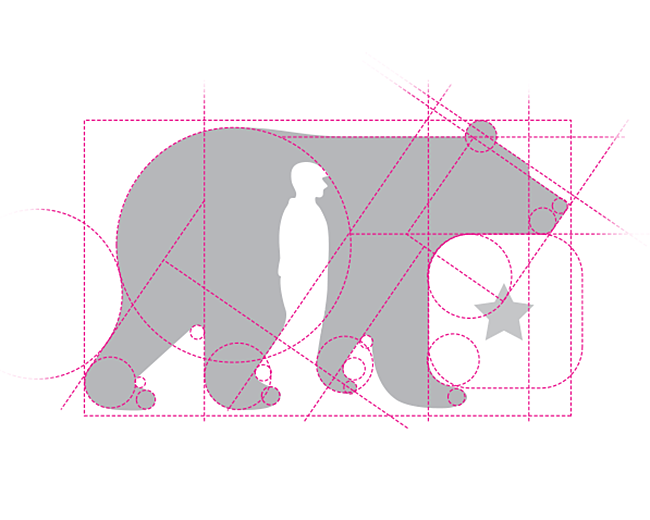
ReplyI agree, and yes, the bear's legs are actually more clear in this version.
ReplyYes. Better. I would even say perfect.
Replywhy is the 'RT' capitalized? Is there a significance to the star other than filling an awkward space? Love the image of the Bear/Person walking together, just thinking there is a more elegant typography solution.
ReplyReally glad my insight helped you tweak it. Also, I agree with everyone -- concept is far clearer here, nice execution. This is far better, great re-work Rudy.
ReplyQued%F3 bastante bien compa%F1ero!
ReplyThank you so much guys for your comments and floats for this one. I'm happy with this one now.
Replythis works great. mission accomplished
ReplyThank you Jonas and Nash so much.
ReplyGuys! Is it me or Logopond is really slow in loading every single page?*
ReplyVery nice one!
ReplyMuch appreciated Zsolt.
ReplyGreat logo!*I love your mark design.
ReplyWonderful work here Rudi:)
ReplyHey Luka, sorry I missed your comment, but thanks so much.**And thank you Ivaylo :)
ReplyI love the use of negative space, it naturally fits there. Its very well executed. I have a lot to learn :) I would love to be the part of this community and learn from you guys..
ReplyThank you @brandingbros, yes, there are great people in this community apart from their design skills.
ReplyWonderful work!
ReplyThanks again @ akinom11 much appreciated.
Replyi love this one :)
ReplyThank you so much @Ghanyleo
ReplyPlease login/signup to make a comment, registration is easy