FGS v4.a.
by rudyhurtado • Uploaded: Jul. 30 '10

Float
(Floaters:
35 )
Description:
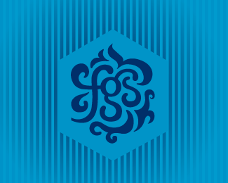
FGS logo, I found they are not easy letters when together, Version 4.a , WIP.
Status:
Nothing set
Viewed:
2537
Share:


Lets Discuss
Thanks Mazzu, it would be one application (variation) of the Brand when it applies.
ReplyCool stuff Rudy!
ReplyThanks Michael, glad you like.
ReplyReal nice, Rudy.
ReplyThank you very much Joe.
ReplyI'm really drawn to this. Very unique and cool. I like that it looks like a random flourishy shape at first, but it's actually VERY legible once you give it a glance for more than a second. Overall, very nice job.
ReplyVery nice emblem / monogram ... know how hard is achieve that interconnection between letters, good job.
ReplyThank you guys Adam and Jan for your kind words and support.
ReplyRudy, this one's very purty %3B)
ReplyGreat solution Rudy!
ReplyThank you kpochwat and bigoodis, I'm glad you approve.
ReplyNice job working that text into something so beautiful! Love it%7E!
ReplyThank you so much Luma.
ReplyPlease login/signup to make a comment, registration is easy