Description:
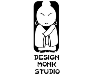
Design monk is a personal logo for my graphic design studio. I have used positive and negative space, where negative space forms the monk.
Status:
Nothing set
Viewed:
1826
Share:
Lets Discuss
I think the slanty eyes are an overplayed and stereotypical way of showing %22Asian%22. and also, not all monks are Asian. Sorry ruchita.
Replyok
ReplyPlease login/signup to make a comment, registration is easy