Description:
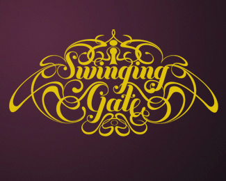
This is a university project for a wine bottle logo design. I wanted to make something that took reference from ornate iron work found on gates in wealthy estates, and the supporting line work to help create a sense of movement. I took influence from Art Nouveau because I liked the how the line work often swung back in on its self making that swinging motion I wanted to achieve.
Any feedback is appreciated.
Status:
Student work
Viewed:
1367
Share:


Lets Discuss
Well you certainly achieved what you set out to do. It's quite elaborate to the point that legibility suffers a bit. But well executed.
ReplyPlease login/signup to make a comment, registration is easy