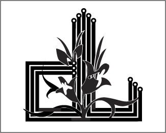
tommi lounge - bar - restaurant
by roogers • Uploaded: Oct. 26 '07

Float
(Floaters:
3 )
Description:
..........comments/critique please, go on, I can take it
Status:
Nothing set
Viewed:
2957
Share:


Lets Discuss
i like very ornate
Replyi think it is nice work, but for doing a good press work it is hard to use because as a small picture it will not be easy to read
Replyyeah, this was initially designed for external signage %26 subtle wall graphics.. but they liked so much we used on all fliers/menus/stationary etc.. it printed up pretty well actually
ReplyI think the flourishes coming off of the %22I%22 are making it look like a %22D%22 - it's a bit confusing. And your smaller type is pretty much illegible. I like the overall technique though.
ReplyLove the ornaments and overall look, but can't really read the smaller type. The I on Tommi is a bit hard to make out too.
ReplyPlease login/signup to make a comment, registration is easy