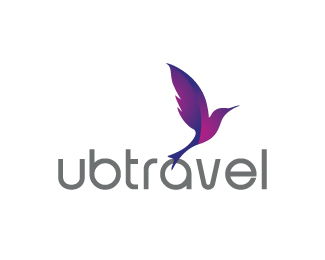
yubitravel
by ronyxu • Uploaded: Mar. 26 '10

Float
(Floaters:
4 )
Description:
a logo for tour and travel company
Status:
Nothing set
Viewed:
2183
Share:


Lets Discuss
I like the colors and the icon is really cool. I don't think the type lives up to the rest of it.
Reply%5EAgreed. The type kind of lets it down. The mark is great though. One nit picky comment, I could see a little use of negative space on the green shape to better match the other sections.
Replyyeahh ... i agree with you. chrip and ocularink, i try to change the font but dont find the good one :(, have any advice?
Replylike this among the rest, but somehowit do look like an organisation logo :)
ReplyPlease login/signup to make a comment, registration is easy