Float
(Floaters:
0 )
Description:
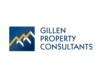
Logo for property consultants company. I will be happy to hear your opinions
Status:
Nothing set
Viewed:
3333
Share:
Lets Discuss
I like this logo. I'm not sure if it was intentional, but I see both rooftops of houses, and subliminally, a sales chart type of graphic showing upward sales momentum - which I think is a good thing. If you wanted to, you could play up the sales chart thing by cropping off the left side of the lower-left roof and the right side of the upper-right roof so that it doesn't look like the chart is declining at the end. Regardless, nice logo.
ReplyHi. Thanks for good words. Idea with trend line came up to me kind of accidentally when I was playing with three roofs shapes. Client speciality is advising others and investing their money on property market, so I thought that ascending trend line is not a bad message :) I did cropped version too, but it didn't look that nice. Greets
ReplyPlease login/signup to make a comment, registration is easy