Description:
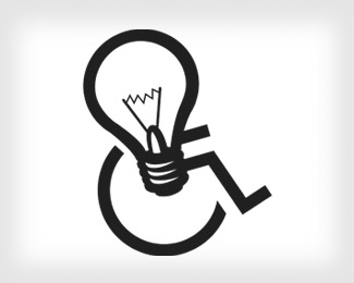
My personal logo. I am in a wheelchair so I thought playing on that would be fun.
Updated.
Status:
Nothing set
Viewed:
1590
Share:


Lets Discuss
Very creative! Caught my eye in the thumbnail. Brings you in. Great idea!
ReplyGreat idea!! Why is the arm slightly lighter than the rest of the illustration? Also, I think if the width of the right side of the bulb matched the width to the left, it would be more balanced. All in all, nice job!
ReplyStriking Idea. I like this logo.
ReplyNice work! I agree OcularInk, a little bit of tweeking %26 it would look awesome
ReplyThanks for the thoughts. I will make the changes and repost.
ReplySweet concept.
ReplyGreat idea!! Simple and brilliant. :)
Replyto be honest.. as cool as this is.. your a designer.. whether your in a chair or not.. i say this because first off you dont want to have to keep explaining your in a chair every time someone feels offended by the concept (%26 then subsequently embarrassed when they're informed)... %26 secondly... %26 i dont mean to be implying anything here but.. allow a potential client to judge you on your ability as a designer... EVERYTHING else should be second... or entirely out of the equation... im sure you understand what i mean...**anyway dude.. i checked out the rest of your stuff .. %26 it rocks!
ReplyOh I don't want pity. I just thought it was funny. Most of the time people are only seeing my logo after seeing my work.
ReplyThe two differant styles used on the wheelchair pictogram and lightbulb does not look homogeneous. The wheelchair pictogram is very mathematical and pure while the bulb is overly detailed. It would be nice for them to look as one piece ie. same strokes same mathematical precision etc.*I find the bulb gives a certain weight to the top left causing the entire mark to look like its falling over.
ReplyPlease login/signup to make a comment, registration is easy