Description:
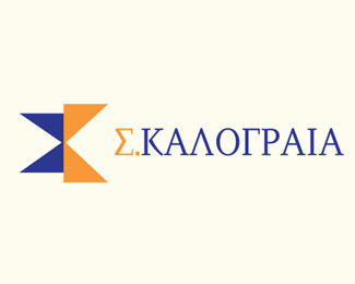
In the development of this logo I did a very stylised letter form with the use of 'S' and 'K'. The client however wanted 'Σ' and 'Κ' as they are a Greek company. This didn't work in the original concept, so I had to go back to the drawing board. After some thinking and many variations of the design, I was thinking about how I teach Gestalt theory, and this concept popped into my head. Again, it works in colour a little better, but the idea is that the sigma is in negative form and the kappa is in minimal form and together they form a united shape to create the logo.
As seen on:
Kalograia
Status:
Client work
Viewed:
1743
Tags:
logo
•
symbol
•
gestalt
•
education
Share:

Lets Discuss
Please login/signup to make a comment, registration is easy