Float
(Floaters:
5 )
Description:
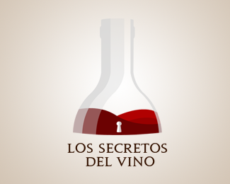
Logo proposal The secrets of Wine : "Los secretos del Vino"
Status:
Nothing set
Viewed:
3335
Share:


Lets Discuss
Please leve your comments :)
ReplyI think you need to simplify your decanter (that's a decanter, right?). i think maybe matching the right side of the decanter with the left side would help. Also, your keyhole seems a little to small. nice concept :)
ReplyWhat gyui said. And your type needs a little work: kerning, word spacing, second line looks off center to the right.
ReplyDon't know if this is part of your intent or not, but I immediately saw a woman's strapless dress in the wine, with the bottle or decanter making her neck.
ReplyI'm with pineapple, but I saw a little lower on the torso. The bottle seems blurry like it is what you would see the morning after with a hangover.
ReplyThanks four your comment, i'll prepare new version soon. :)
ReplyPlease login/signup to make a comment, registration is easy