Description:
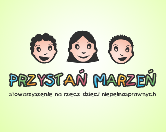
A small work done for a friend of mine who has created a foundation that helps children with disabilities and their parents.
As seen on:
http://robakdesign.com/identity10.php
Status:
Nothing set
Viewed:
2322
Share:





Lets Discuss
I think the sharp illustration style doesn't match the feel of the type. Also, if you are going to use %22handwritten%22 fonts I would modify each repeat instance of a letter so it doesn't scream %22fake handwriting%22.
Replythis is not a logo :( thi is an illustration and to complicated i'd think...
ReplyPlease login/signup to make a comment, registration is easy