Description:
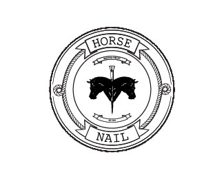
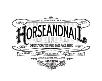
Logo for NYC handbag company Horse + Nail. Horse + Nail integrates horse riding hardware and materials into the designs of their bags. The goal of the logo was to embrace the culture and classic look of the early 1900's.
As seen on:
Rivington Design House
Status:
Client work
Viewed:
3770
Tags:
nail
•
badge
•
horse
•
nail
Share:



Lets Discuss
Not trying to offend, however, the composition of two horse heads with a nail through them is a bit on the creepy side. I'm also not getting the %22AND%22 part of the name from this logo - instead I read it as %22HORSE NAIL%22. And finally, the type in the smaller banners is impossible to read. I think overall it's a good start, but it needs refinement. Good luck.
Replysdijock nailed it
ReplyThe Horse and Nail in the center is the or %22and.%22 In terms of creepy, the bags have a very modern, Gothic yet high fashion look. It's important to see the product or brand direction of a company in order to full understand the scope. Wouldn't you say... at least in some cases.
ReplyIn terms of understanding the scope, I'm assuming that your logo will most likely exist both on and off of the bags in other applications such as on stationery, signage, etc. So it's likely that you might not have the context of the modern/gothic bags as a backdrop to help support this logo all the time. Therefore, the logo will have to work as a standalone graphic sometimes to convey the brand. So my initial comment about the creepiness of the logo does have merit/significance in those instances. As I said, I'm not trying to offend, I'm just providing my observations - take it or leave it, I don't care either way. Good luck.
Replyomg ... I have to totally change my style
Replylogopond got hacked :) or i don't know what's going on :)
ReplyPlease login/signup to make a comment, registration is easy