


Description:
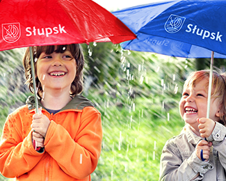
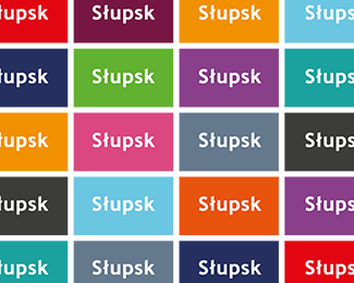
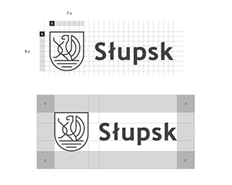
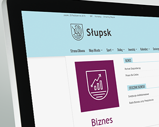
We were commissioned to create a flexible, multidimensional visual identity system of the city that would simplify communication with inhabitants, tourists, representatives of public authorities or investors. The brief had a clear message – the new logo must reference the city’s coat of arms. Therefore, the griffin and three waves of the Słupia River are part of the main creative concept.
more at https://goo.gl/XcnAlB
As seen on:
http://www.riocreativo.eu/branding/slupsk
Status:
Client work
Viewed:
12633
Tags:
place
•
Poland
•
system
•
visual
Share:

Lets Discuss
Please login/signup to make a comment, registration is easy