Float
(Floaters:
0 )
Description:
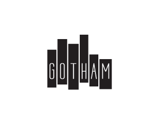
Identity design for Gotham. (Restaurant)
Status:
Nothing set
Viewed:
925
Share:



Lets Discuss
hope this restaurant isn't in Seattle, www.kexp.org**ps i think the different weighted bars are a bit distracting... some letters seem to breathe better and others seem squished.***
ReplyThe 'A' looks very girly.
ReplyI actually like this logo a lot. And in looking at the kexp.org... I think this stands alone is a far superior logo to theirs. Great work.
ReplyPlease login/signup to make a comment, registration is easy