by ricardobarroz • Uploaded: Feb. 09 '12

Float
(Floaters:
10 )
Description:
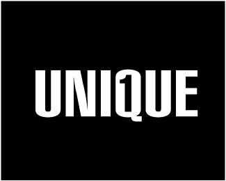
Print is the result of a typographic study.
Unused Proposal
Email: Ricardo@alcepixel.com
Twitter: http://twitter.com/ricardobarroz
Status:
Unused proposal
Viewed:
13068
Tags:
biggest
•
subliminal
•
biggest
•
subliminal
Share:

Lets Discuss
I think it's a interesting idea and has great potential.*The T would be more obvious if you make all letters in similar style to this print icon I think.*Good luck!
Reply:) Nice, this looks much better to me.*I would just increase kerning, to give letters more space. Or if you like them this close, I suggest you to remove double line Between IN and NT.*Good luck!
ReplyI love it Ricardo! cool! ;)
ReplyThanks, @lukelovesyou :)
ReplyThanks for the tips @Balic, Great!
ReplyPlease login/signup to make a comment, registration is easy