Description:
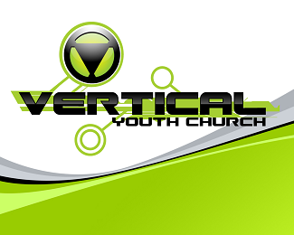
logo for a church youth group
Status:
Client work
Viewed:
1945
Tags:
•
logo
•
green
•
vertical
Share:


Lets Discuss
There is a lot going on here. I understand the colour and the activity for the youth market, but I think reducing the elements is the first step for improvement. Im also not sure what the triangle mark is?
Replythe green and gray background wave is not part of the original logo, simply an additional graphic element for some print material. As for the triangle element - it is a %22V%22 for vertical. The %22V%22 is designed to be an icon. This client also has other named groups that start with the letter %22A%22. By inverting the %22V%22 to form an %22A%22 it keeps the continuity and visual association.
ReplyI think the idea behind the mark has potential, but right now it looks like a steering wheel. I would work in black %26 white at this stage, and get rid of color, gradients, and background effects. Focus on refining the icon and text. Try to communicate what it means to be part of Vertical. Also, the whole thing feels very horizontal right now. Maybe think about ways of communicating the driving force and idea of the group in an abstract way. Hope that helps!
ReplyPlease login/signup to make a comment, registration is easy