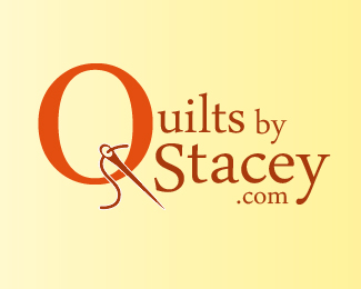
Description:
Created for clients interested in purchasing quilts whether custom or choosing from patterns.
Status:
Work in progress
Viewed:
547
Share:
Lets Discuss
Need some help with this one. Anyone have any suggestions to make this logo great?
Replyhold my beer...
ReplyYou should simplify. There's too many different font sizes and it's clear that your Q is made from an O so it reads that way, especially next to "uilts".
ReplySo how does one effectively use a needle without using an actual "Q"?
ReplyNido, I couldn't just hold your beer without having a taste. It's all good, right?
ReplyIF you're going to put a needle in the letter "Q," it's best to start out with an actual... "Q." The shapes are quite different if you look at them closely.
ReplyI agree with a lot of what samdemastrie said... in particular the amount of varying font sizes you have... I think this could still work with a clean, all uppercase san-serif font with all the words on the same line and of relatively equal size. At least to begin with anyway, you need to tidy this up a bit.
ReplyAnd, yeah, look into that O/Q thing too.
Keep the beer ;)
Jason, if you want to get this thing better, listen to what Nido and Tabitha are saying, they know what they are talking about. Just saying!
ReplyTo Nido, Samdemastrie, Tabithakristen and Rudy Hurtado. First of all, I am a curious person and looked at all of your works and I must say, you are champions in the world of logo design. I am most unfortunate however, as I love to work with Photoshop but am no designer and I am ok with this. I will not quit my day job. But I occasionally get a gig and this one is for my boss.
ReplyI did try to use all uppercase san-serif fonts with all the words on the same line but it looks horrible. Could you please possibly be more descriptive as to what would look good as I don't believe we are on the same page or planet. Thanks for all of your time!
Hi Jason. As you have probably surmised by now, your logo here is actually not that bad. And you probably know it because you have asked fellow designers on how to make it 'great'. While the abovementioned designers were more than willing to provide their assistance to 'guide' you along (because they also saw the possible potential of a great logo in the making) it was however unneccesary (and unwise) for them to provide 'more decriptive' suggestions on how you should go about it. A nudge in the right direction is one thing but to tell you specifically on how when what and why would not benefit you as an amatuer designer. Logopond was built specifically to guide and inspire young and passionate designers by sharing our work. It is not a vehicle for getting definitive design help. Because to put it bluntly, that would be like designing the logo FOR you. Take the advices given and start going to town on experimenting with what you have. Its the only way you are going to improve and flourish as a designer. Good luck my friend.
ReplyPlease login/signup to make a comment, registration is easy