Description:
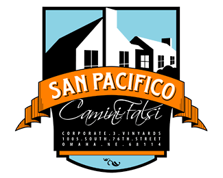
playful logo with deco-styled hints, created for a client gift package for Corporate 3 Design.
Status:
Nothing set
Viewed:
3964
Share:


Lets Discuss
I can't read any of it. Well I can see San Pacifico.
ReplyI'll try to upload a slightly larger file...
Replythat should be better...
ReplyI don't see this as playful, not crazy about the typography, the colors do catch my eye and there are elements I like, but maybe there is to much going on?
ReplyI appreciate your opinion. I see your point. I should reprhase as %22stylized%22. I suppose the subject matter makes it a bit playful because it's not a real wine and the name Camini Falsi means %22Fake Chimney%22. (inside joke between the firm and their clients) **There is a lot going on because it doubled as an actual label as well as the logo (see the address in the bottom section). So that's a good observation, though it served it's purpose and went over very well with the audience.**Thank for weighing in. All info helps me out.
ReplyPlease login/signup to make a comment, registration is easy